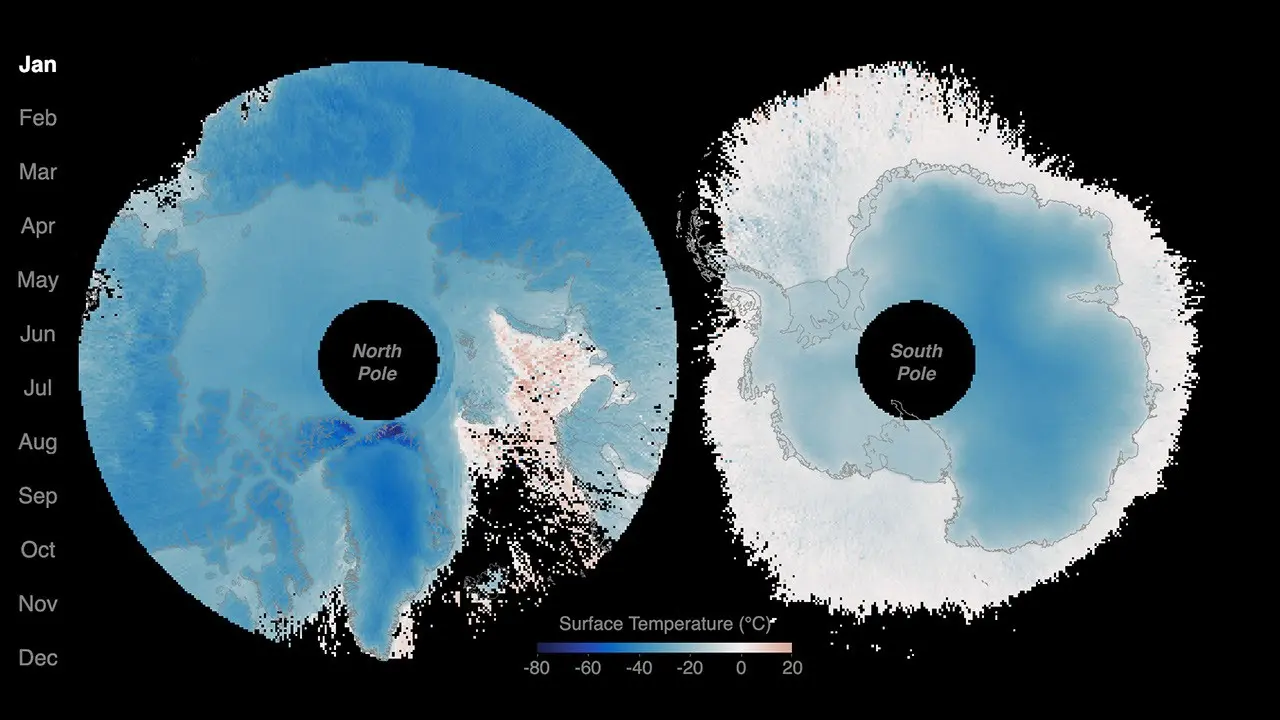
At first glance, the poles in NASA’s new animation seem to breathe. Colors spread across the Arctic and Antarctic, retreat, and return as each hemisphere moves through winter and summer. Dark blue marks colder surfaces; lighter blue, yellow, and red mark progressively milder or warmer ones.
The sequence is based on two years of data from NASA’s Polar Radiant Energy in the Far-InfraRed Experiment, or PREFIRE. The mission’s twin CubeSats began collecting science observations in July 2024, giving researchers two complete seasonal cycles at each pole for the visualization released on August 7, 2026.
But the most important thing about the animation is also the easiest to misunderstand: it maps surface temperature. It is not a direct movie of far-infrared energy escaping to space, and it does not show that either pole warmed over the two-year period.
That distinction matters because PREFIRE’s central scientific task happens several steps behind the colorful surface map. Its instruments measure radiation in specific wavelengths. Scientists then use those observations, together with information about clouds, water vapor and the surface, to estimate how energy moves through the polar atmosphere and out toward space.
Two poles, opposite seasons
The NASA Earth Observatory animation makes a basic feature of Earth’s climate unusually vivid. As the Arctic moves toward summer, the Antarctic moves toward winter, and then the pattern reverses. The contrast is not evidence of an emerging trend. It is the expected alternation of seasons across hemispheres, shown through a new stream of satellite-based data.
Surface temperature here means the temperature of the radiating “skin” of land, ocean or ice. It is not the same quantity as the air temperature reported in a weather forecast. Nor is a warm-colored patch automatically a place releasing the most total heat to space. Energy leaving the surface still passes through an atmosphere containing clouds and gases that absorb and emit infrared radiation.
NASA says the visualization is based on PREFIRE observations, but the published page does not specify every processing choice behind it. It does not document the exact retrieved fields, gridding, interpolation or uncertainty used to turn the satellite record into a continuous animated map. The result is valuable as a view of seasonal structure, but it should not be treated as a raw image straight from a detector.
What the satellites actually detect
PREFIRE’s instruments measure spectral radiance: the radiation reaching each detector across distinct wavelength channels and viewing directions. That measurement is closer to what the spacecraft directly observes than either temperature or heat flux.
NASA’s data system also provides higher-level products. These include retrieved atmospheric and surface properties, including surface temperature, as well as spectral energy flux. Producing them requires algorithms that interpret the measured radiance using information about the scene below—whether the view contains clouds, what the surface is like, how much water vapor is present and how radiation is distributed by angle.
The difference is more than vocabulary. Radiance describes what reaches a sensor from a particular direction. Outgoing longwave radiation describes an energy flow toward space across an area. Moving from one to the other is a scientific calculation, not a simple relabeling of the detector reading.
A 2026 algorithm and validation study describes PREFIRE products that estimate spectral outgoing longwave radiation over wavelengths of roughly 5 to 53 micrometers and broadband outgoing longwave radiation over 5 to 200 micrometers. In selected comparisons with other satellite instruments and estimates derived from measurements made closer to the surface, the products met the mission’s stated mean accuracy requirements: within 8 watts per square meter for broadband radiation and 4 watts per square meter for polar far-infrared radiation.
Those results are evidence that the retrieval system performed to its stated requirements in the comparisons studied. They are not a guarantee that every individual pixel or scene carries the same error. Calibration, cloud and surface classification, and the models used to convert radiance into flux all affect the result.
Filling a blind spot in the polar energy budget
Every part of Earth exchanges energy with space, but the poles have been especially difficult to observe. Cold surfaces and a dry atmosphere allow a large share of polar thermal emission to occur at wavelengths longer than 15 micrometers—the far infrared.
The mission’s scientific overview estimated that these wavelengths account for about 60 percent of polar thermal emission and noted that this portion had not previously been measured systematically by wavelength. The polar qualifier is essential. The figure does not mean that far-infrared radiation accounts for 60 percent of all energy leaving the entire planet.
Resolving the spectrum matters because different wavelengths interact differently with water vapor, clouds, ice and snow. Two places with similar surface temperatures may not shed energy to space in the same way if their atmospheres and surfaces differ. PREFIRE was designed to provide observations that can help scientists represent those processes more faithfully.
That potential extends to weather and climate models, but the present animation is not a test of forecast skill. Neither two years of measurements nor a visualization can show that incorporating PREFIRE data has already improved predictions. That question requires separate evaluation after the observations are assimilated into models.
A baseline, not a verdict
The short record does not make it unimportant. Two full cycles let researchers see both poles across darkness and daylight, cold and comparatively warm seasons, and changing atmospheric conditions. They also provide a foundation for testing how consistently the instruments and retrieval algorithms perform across sharply different scenes.
What the record cannot support is a claim that the poles warmed or cooled over these two years. A repeated seasonal pulse is not the same as a climate trajectory. Individual warm and cold patches may be scientifically interesting, but interpreting them requires context beyond the animation itself.
PREFIRE’s early value is therefore less dramatic, and more useful, than a sweeping conclusion about the climate. The mission is beginning to supply spectral observations in a region of the energy budget that researchers have long struggled to measure. The surface-temperature animation offers an accessible view of where and when the polar seasons unfold. The radiance measurements beneath it are what may eventually sharpen understanding of how those regions exchange energy with the atmosphere and space.
Two years are enough to see the seasonal rhythm. They are the beginning of the measurement record, not its final verdict.