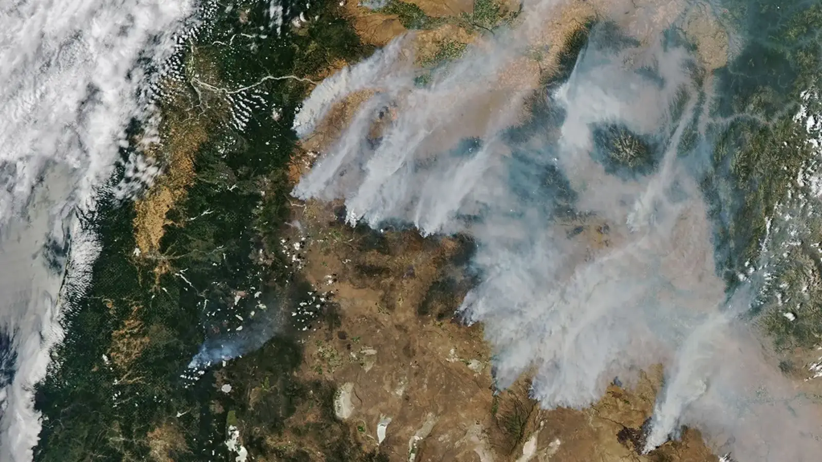
On the afternoon of July 26, 2026, NASA’s Aqua satellite passed over a Pacific Northwest transformed by fire. Its view showed long gray plumes leaving dozens of fires across central and eastern Oregon and streaming northeast. Some plumes remained distinct near their sources; farther downwind, they merged into a broad veil.
The image published by NASA Earth Observatory is striking because it compresses a sprawling emergency into a single frame. It is also easy to ask more of that frame than it can answer. A satellite can show where smoke was visible during an overpass. It cannot, on its own, give a neighborhood’s ground-level air-quality reading, map an evacuation order, or say how a fire behaved after the spacecraft moved on.
Reading the scene accurately therefore requires three layers of evidence: the orbital image for regional scale, incident reports for conditions on the ground, and air-monitoring networks for the pollution people were breathing.
A one-day portrait of a fast-moving emergency
The sequence began well before the image. NASA reported that dry thunderstorms crossed the Cascade Range on the evening of July 15 and moved east over Oregon and Washington. By the next day, satellites were detecting many new fires in central and eastern Oregon. Gusty winds, summer heat, and drought-stressed vegetation then helped some initially small fires grow rapidly.
By July 26, the visible plumes came from a crowded field of incidents rather than one dominant blaze. NASA identified the Hay Creek Complex, Brewer, Big Grass, Akawa Butte, and Powder River fires among the largest active fires that day. Other fires, including Beachcomb, Bench, and Second Flat, were threatening communities. On July 26, the Oregon State Fire Marshal reported that the Emergency Conflagration Act had been invoked for those three fires, bringing state resources to support local response.
The next morning’s National Interagency Coordination Center report put numbers around that picture. At 7:30 a.m. Mountain Daylight Time on July 27, the Northwest Area was at Preparedness Level 5. The report listed 54 incidents, 51 uncontained large fires, and 15,483 personnel assigned across the region. Its active-incident summary recorded about 1.56 million cumulative acres.
Those are regional figures, covering the Northwest coordination area’s Oregon and Washington operations; they are not Oregon-only totals. They were also a dated operational snapshot, not final measurements. The same report notes acreage reductions for some fires after more accurate mapping, a reminder that early perimeter estimates can move in either direction as better information arrives.
What an afternoon pass adds
The instrument behind the image was the Moderate Resolution Imaging Spectroradiometer, or MODIS, aboard Aqua. MODIS measures radiation in 36 spectral bands, and the Terra and Aqua instruments together view the entire Earth every one to two days. Aqua crosses the equator in the afternoon, making its July 26 pass a daylight look at the fires and the smoke carried away from them.
That broad, repeated coverage is the advantage. Ground crews necessarily see individual roads, slopes, structures, and fire edges. A wide satellite view can reveal how multiple plumes align with the wind and combine across hundreds of miles. Sequential observations can also show where new heat detections appear and how smoke transport changes from one pass to the next.
NASA turns those observations into more than a finished photograph. Its Fire Information for Resource Management System distributes near-real-time active-fire data from Earth-observing satellites, while Worldview lets users examine layers and dates. These systems help place an individual scene within an evolving record. They do not replace the local incident command’s perimeter, closure, or evacuation information.
A visible plume is not an AQI reading
The distinction became practical on July 27, when the Oregon Department of Environmental Quality issued an air-quality advisory for 13 counties in eastern and parts of central Oregon. DEQ attributed the smoke to multiple fires in southern, central, and eastern Oregon and said the advisory would remain in effect until further notice. It also warned that smoke levels could change rapidly with the weather.
An orbital image and an air monitor answer different questions. The image shows the horizontal reach of visible smoke at one moment. Surface monitors measure particle concentrations at particular places and times. Smoke can travel in layers, mix downward unevenly, and pool differently with terrain and weather, so a gray patch seen from orbit cannot be translated directly into a local Air Quality Index value.
For smoke events, AirNow directs the public to its Fire and Smoke Map. The EPA–U.S. Forest Service product reports fine-particle pollution, or PM2.5, which AirNow identifies as the key pollutant in wildfire smoke. It combines data from permanent and temporary monitors with thousands of crowdsourced sensors, and also displays fire locations, smoke plumes, and forecast outlooks where available.
That does not make the satellite view less useful. It explains why the most responsible reading pairs the two. The view from space supplies continuity across places where monitoring may be sparse; the surface network supplies the local concentration that the photograph cannot.
The timestamp is part of the evidence
Wildfire images often outlive the conditions they record. The NASA frame was captured July 26 and published July 28. The NIFC figures above describe the morning of July 27. The DEQ advisory was issued July 27 and was open-ended at publication. None should be treated as a current evacuation notice, containment report, or air-quality forecast after those dates.
That temporal discipline is especially important in a regional outbreak. Wind can shift a plume within hours; crews can revise a perimeter after an infrared flight; a fire can cross a control line; a monitor can move from one AQI category to another. The apparent authority of a map does not freeze any of those processes.
What the July 26 image preserves is the scale and connectedness of the event. Dozens of separate fires produced an atmospheric feature that crossed county and state lines, making visible the distance between a flame front and the communities affected by its smoke. The satellite, incident report, and air-quality network each captured a different part of that reality. Together they make the picture useful evidence rather than merely a dramatic view.